Imagefilm für
die Graphische
Team: Zita Gaier, Sam Bajoghli, Theo Lechner, Joshua Krüger, Matteo Böhm, Atilla Babacan, Cian Mulrooney, Michelle Kerzendorfer, Bernhard Wallentin
Gemeinsam mit einem großartigen Team aus Mitschülern habe ich etwa ein halbes Jahr an einem Imagefilm für die Graphische gearbeitet. Das Ziel war simpel: Wir wollten angehenden Schülern und ihren Eltern zeigen, was die Schule alles bietet – von Fotografie und Grafikdesign bis hin zu Druck und Multimedia. Dabei sollte das Ergebnis authentisch wirken und die Atmosphäre der Schule widerspiegeln. Wir wollten etwas schaffen, das man sich gerne anschaut – egal ob beim Tag der offenen Tür, bei Vorträgen oder auf der Website und YouTube. Keine steifen Interviews, kein generischer Corporate-Vibe. Wir wollten einen Kurzfilm, der wirklich eine Geschichte erzählt.
Worum es im Film geht
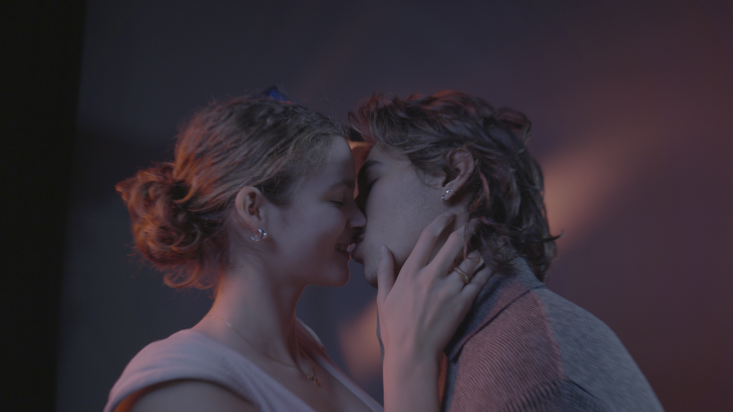
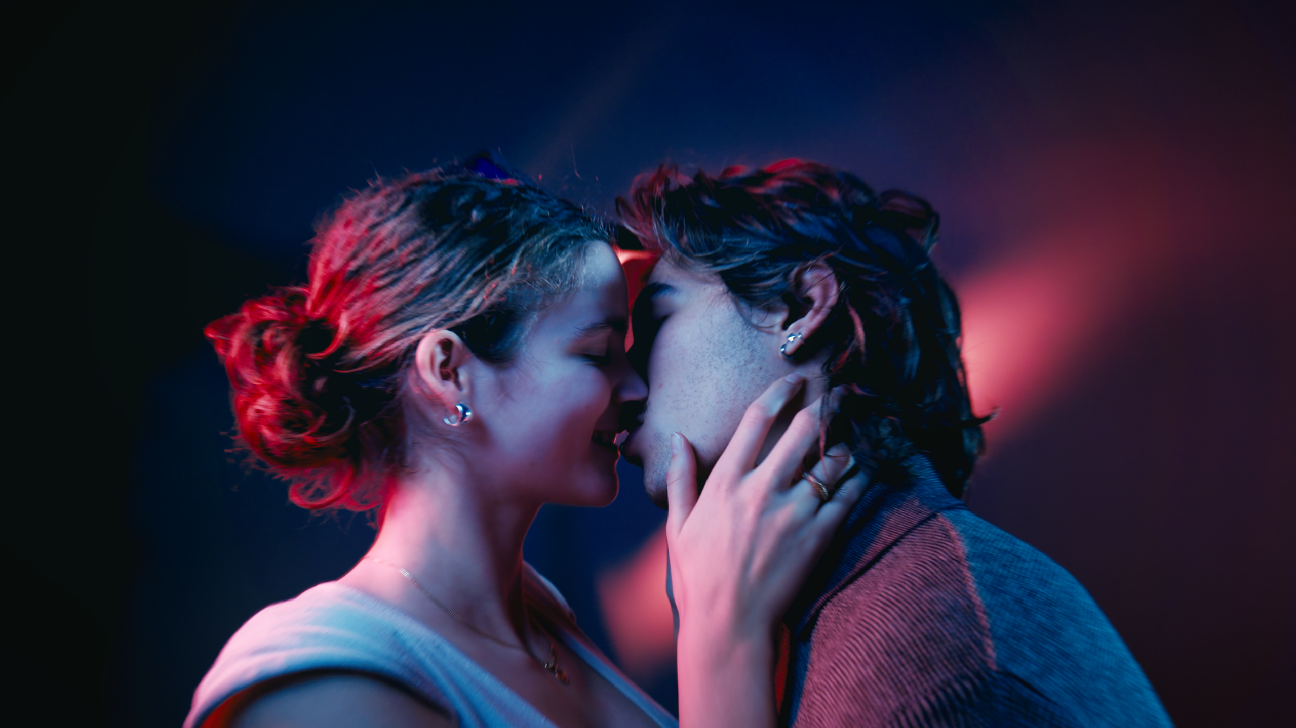
Die Graphische ist ein kreativer Ort, deshalb haben wir das Konzept um kleine Momente herum aufgebaut, die sich zu einer großen Reise zusammenfügen. Anstatt Kapitel mit klassischen „Talking Heads“ (Interview-Szenen) zu drehen, haben wir Mini-Storys kreiert, die verschiedene Schüler begleiten. Die Idee dahinter war zu zeigen, dass all diese verschiedenen Abteilungen dieselbe kreative Sprache sprechen.
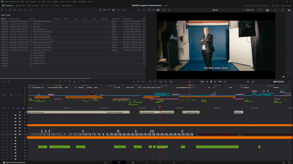
Postproduktion: Wo die Puzzleteile zusammenfanden
In der Postproduktion kam alles zusammen – und hier wurde es auch kompliziert. Was als ziemlich klarer Plan begann, entwickelte sich zu einem langwierigen, detaillierten Prozess, der viel mehr Zeit in Anspruch nahm als erwartet. Viele Szenen, die am Set gut aussahen, funktionierten auf der Timeline nicht so, wie wir es uns vorgestellt hatten. Manche Übergänge passten nicht, das Pacing fühlte sich an einigen Stellen falsch an und einige Aufnahmen entsprachen einfach nicht dem Rhythmus der Geschichte, den wir anstrebten. Ein großer Teil der Postproduktion bestand also darin, Momente quasi neu zu erfinden, die während der Produktion nicht wie gewünscht gezündet hatten.
Ich habe viel Zeit damit verbracht, den Film umzustrukturieren und neue Wege zu finden, um Szenen visuell und emotional miteinander zu verknüpfen. Manchmal bedeutete das, den kompletten Fluss einer Sequenz zu ändern oder neu zu überlegen, wie wir den Übergang zwischen zwei Abteilungen gestalten. Zusätzlich habe ich subtile visuelle Hinweise und Sound-Bridges eingebaut, damit sich die Geschichte nahtlos anfühlt – obwohl sie aus so vielen verschiedenen Drehs über mehrere Monate hinweg bestand. Es war viel Trial-and-Error: Schneiden, anschauen, anpassen, wiederholen – und das gefühlt eine Million Mal, bis sich das Ganze endlich stimmig und lebendig anfühlte.
Den Look kreieren
Das Color Grading war ein entscheidender Teil, um dem Film seine finale Identität zu geben. Da das Material zu unterschiedlichen Zeiten, in verschiedenen Klassenzimmern und Lichtsituationen aufgenommen wurde, war das Matching (Angleichen der Aufnahmen) eine echte Herausforderung. Anstatt alles in einen exakt gleichen Look zu zwingen, habe ich das Grading genutzt, um jeder Abteilung einen eigenen Ton zu geben, während das Gesamtgefühl konsistent blieb.
Abgesehen vom Matching wollte ich durch das Grading auch Charakter verleihen. Ich habe eine Film-Emulation erstellt, die dem Bild Textur und Tiefe verleiht. Das Endergebnis ist ein Look, der sich bodenständig und echt anfühlt, aber dennoch cineastisch genug ist, um die Aufmerksamkeit zu fesseln.